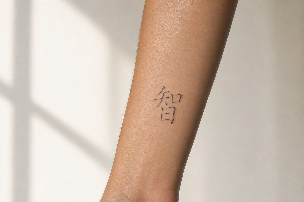
Before the needle

Chinese tattoo symbols: the eight ways they go wrong

Nearly every page you will find on this subject is a gallery: fifty or a hundred characters, one English word beside each, no sources. Those pages are not merely unhelpful. They are the single largest cause of bad Chinese tattoos, because a one-word gloss is exactly the amount of information needed to feel confident and not nearly enough to be right.

So this page is not a gallery. It is a taxonomy of failure, assembled from the errors that show up over and over in Western character work, with the specific check that catches each one. There is a shortlist further down, drawn only from characters we have researched and sourced properly, and it is deliberately short.

None of this is an argument against the idea. Chinese writing is the oldest continuously used script on earth and a character carries more history per square centimeter than any alphabet can. It just does not survive being treated as decoration.

The eight failure modes

Roughly in order of how obvious the damage is, from the ones a stranger will spot across a room to the one only a native reader will ever notice.

  1. 1

    The character is simply not a character

    The purest failure, and still the most common. It comes from two sources: machine translation fed a word it cannot place, and the "alphabet chart" that some studios keep on the wall, matching each letter of the Latin alphabet to a Chinese character. Chinese has no alphabet. Characters stand for words and morphemes, not for sounds, so a name spelled out through such a chart produces a row of unrelated words. Tian Tang, who has been collecting these on Hanzi Smatter since 2004, calls the results the gibberish font. The tell is that no Chinese reader can read it, including the ones who tell you politely that they can.

    The check: Get the characters from a dictionary entry or a sourced reference page, not from a chart, an app, or an image search.

  2. 2

    The character is real, and means something adjacent

    This is the listicle injury. A page gives you one character and one English word, you take the word at face value, and the character turns out to sit somewhere else in meaning. English "power" splits in Chinese across physical force, held authority, and situational momentum, and only one of those is the character usually offered. English "respect" splits between an inner attitude and its enacted form. English "prosperity" is a cluster of at least four characters that a native reader distinguishes instantly. Nothing here is wrong on the skin. It is just not what you meant, and you will never find out.

    The check: Before committing, read a full entry on the character rather than a gloss. If a source cannot tell you what the character does not mean, it does not know what it means.

  3. 3

    Simplified and traditional in the same piece

    Mainland China writes simplified forms; Taiwan, Hong Kong, and Macau write traditional ones. Both are completely correct. Mixing them inside one design is not, and it is the most frequent flaw in Western character work, usually because the characters were sourced one at a time from different places. A literate reader registers it the way you would register a sentence where the font changed halfway through: not unreadable, just visibly assembled by someone who could not read it.

    The check: Pick one system for the whole piece and check every character against it, including any that look identical in both.

  4. 4

    Mirrored, rotated, or upside down

    Characters have a fixed orientation and almost no rotational redundancy, so a flip that would go unnoticed in an abstract design turns a character into a non-character. It happens when a low-resolution reference is traced from the back of a stencil, and it happens with vertical arrangements where the artist has guessed at reading order. Note the one deliberate exception, which trips people the other way: the character for good fortune is hung upside down on doors at Chinese New Year on purpose, because the word for inverted puns on the word for arrived. That is a doorway joke. On skin it just reads as an error.

    The check: Compare the applied stencil against the reference in a mirror before the first line goes in. Mirrored stencils are visible at a glance once you look for them.

  5. 5

    You asked for Chinese and got Japanese

    Japanese writes with Chinese characters and has done for fifteen centuries, so most of the time this changes nothing and the design is correct in both languages. The trap is the minority of characters where Japan's 1949 reform landed somewhere different from China's 1956 one, which produces a shape a Chinese reader clocks as foreign immediately. It is a real failure mode with a narrow footprint, and it has its own page here rather than a paragraph.

    Chinese characters vs. Japanese

    The check: Ask which script the reference file is in. If the answer is vague, treat the answer as unknown.

  6. 6

    A sentence translated one word at a time

    Short phrases fail differently from single characters. Chinese grammar carries meaning through word order and through particles that have no English counterpart, so an English sentence mapped word by word onto Chinese words produces something with the shape of a sentence and no grammar in it. The results read to a native speaker roughly the way tourist-menu English reads to you: the topic is recoverable, the sentence is not, and the overall impression is comic rather than profound.

    The check: For anything longer than two characters, use an established set phrase with a documented source, or have a fluent reader compose it. A four-character idiom with a classical origin is a safer and better-looking choice than a translated motto.

  7. 7

    Drawn rather than written

    Chinese characters have a fixed stroke order, and it is not decorative. Order determines which strokes are laid down under tension and which are released, where a stroke tapers, and how components crowd each other, so a character built in the correct order has a rhythm that a traced outline does not. An artist copying a shape without knowing the order produces something with the right silhouette and dead insides. Chinese readers describe this without hesitating and usually without being able to say why.

    The check: Bring a reference produced by a real brush face or a calligrapher rather than a system font stretched to fit, and let the artist see the stroke sequence.

  8. 8

    Correct, and reads as an office memo

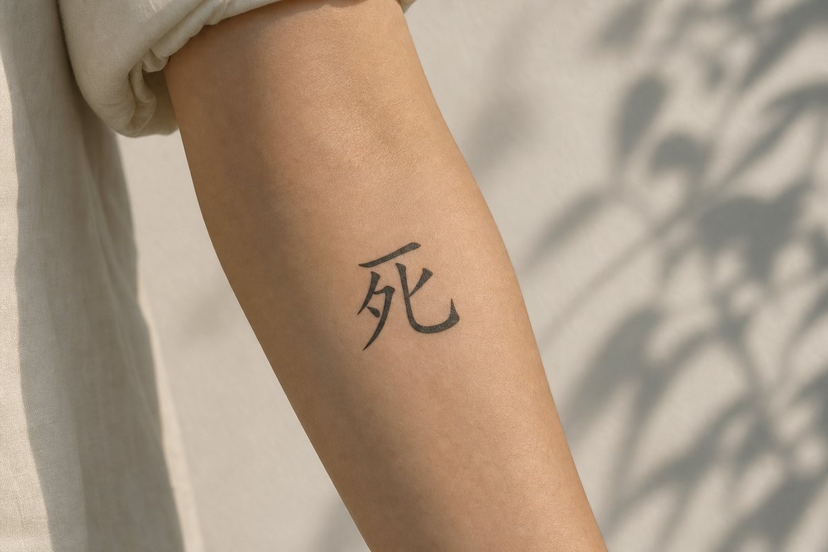
    The subtlest one. The character is right, the form is consistent, the design is clean, and the word is simply not one that a Chinese person would ever put on their body. Some characters are correct but bureaucratic, some carry a register that is closer to a slogan than to a private conviction, and a few are unlucky enough that no native speaker would consider them. The character for death is the clearest case: it is a serious and beautiful word to study, and essentially nobody in the Chinese-speaking world tattoos it, so the effect on a reader is not depth but alarm.

    The check: Ask a native reader what the character makes them feel, not what it means. Those are different questions and only the second one has a dictionary answer.
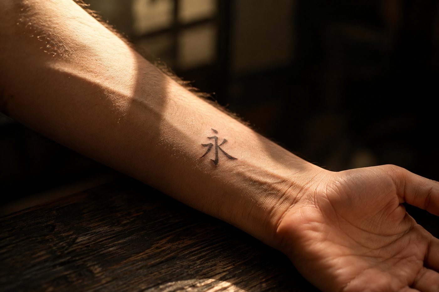
Stroke count is a size constraint, and the arithmetic is unforgiving

The advice to "pick traditional, it looks more authentic" ignores the one constraint that decides whether a character will still be readable in fifteen years. A character is written inside a square. The strokes have to share that square, and traditional forms put far more of them in it.

Fine-line artists work to a rule of thumb: parallel lines in small work should not sit closer than about two millimeters, because ink spreads under the skin as a tattoo heals and keeps migrating slowly for decades. Lines set below that distance do not stay separate lines. They become one thicker line, and the character loses the internal structure that makes it that character rather than a dark patch.

So here is the arithmetic nobody runs. For each pair below, the traditional and simplified forms of a character we have an entry for, we counted the horizontal strokes stacked through the character's height and divided the finished tattoo height by that number. Stroke totals come from our own character entries. The stacking counts are hand-counted from the printed regular-script form, and a different brush style will move any of them by one, which is worth saying rather than pretending to a precision that is not there.

Space between stacked strokes, in millimeters, at three finished heights
Character Strokes Stacked 10mm20mm40mm
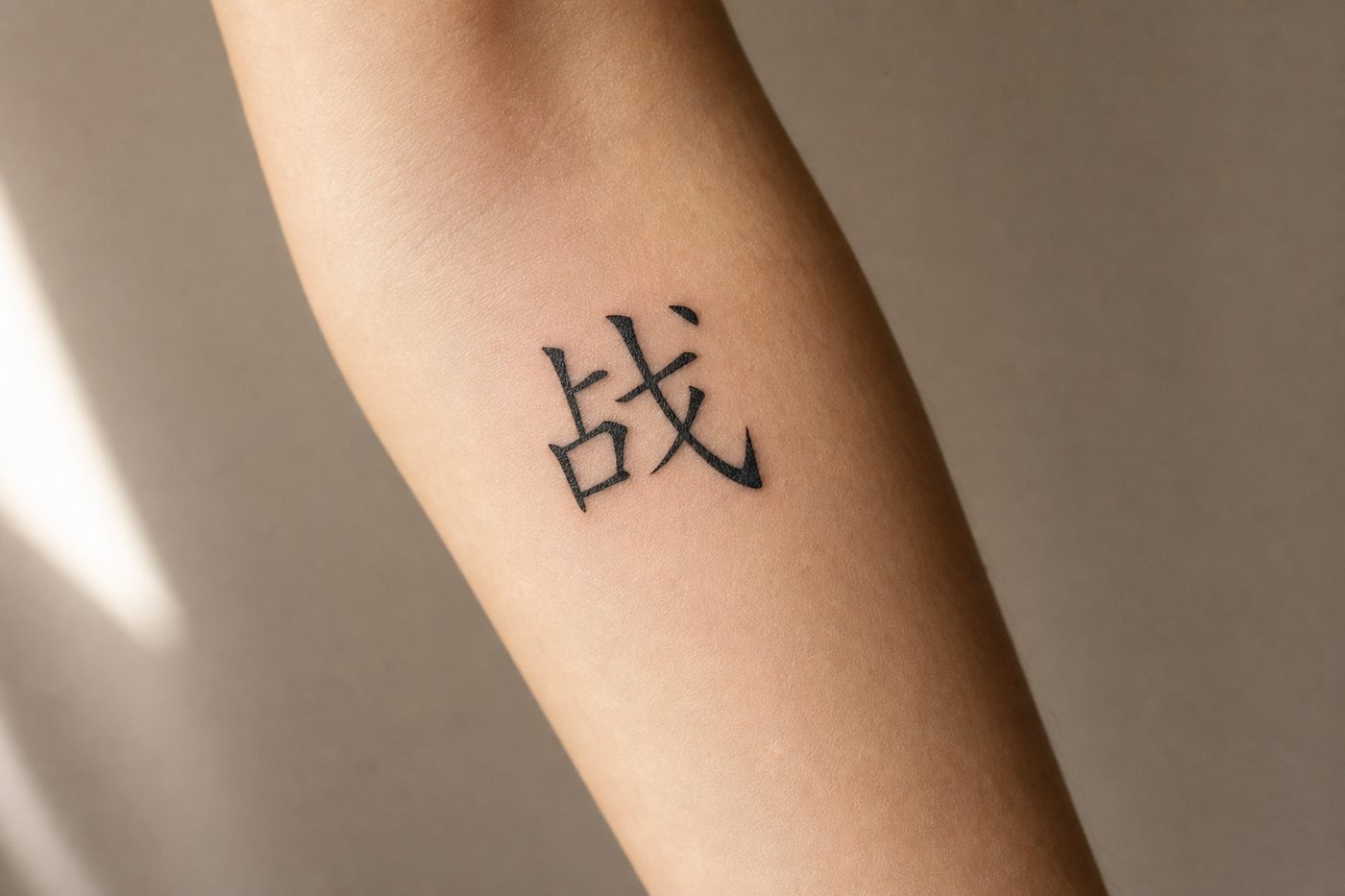
war, traditional 16 7 1.4 2.9 5.7
simplified 9 3 3.3 6.7 13
listening, traditional 22 7 1.4 2.9 5.7
simplified 7 3 3.3 6.7 13
dragon, traditional 16 7 1.4 2.9 5.7
simplified 5 2 5.0 10 20
longevity, traditional 14 8 1.3 2.5 5.0
寿 simplified 7 4 2.5 5.0 10
love, traditional 13 5 2.0 4.0 8.0
simplified 10 4 2.5 5.0 10
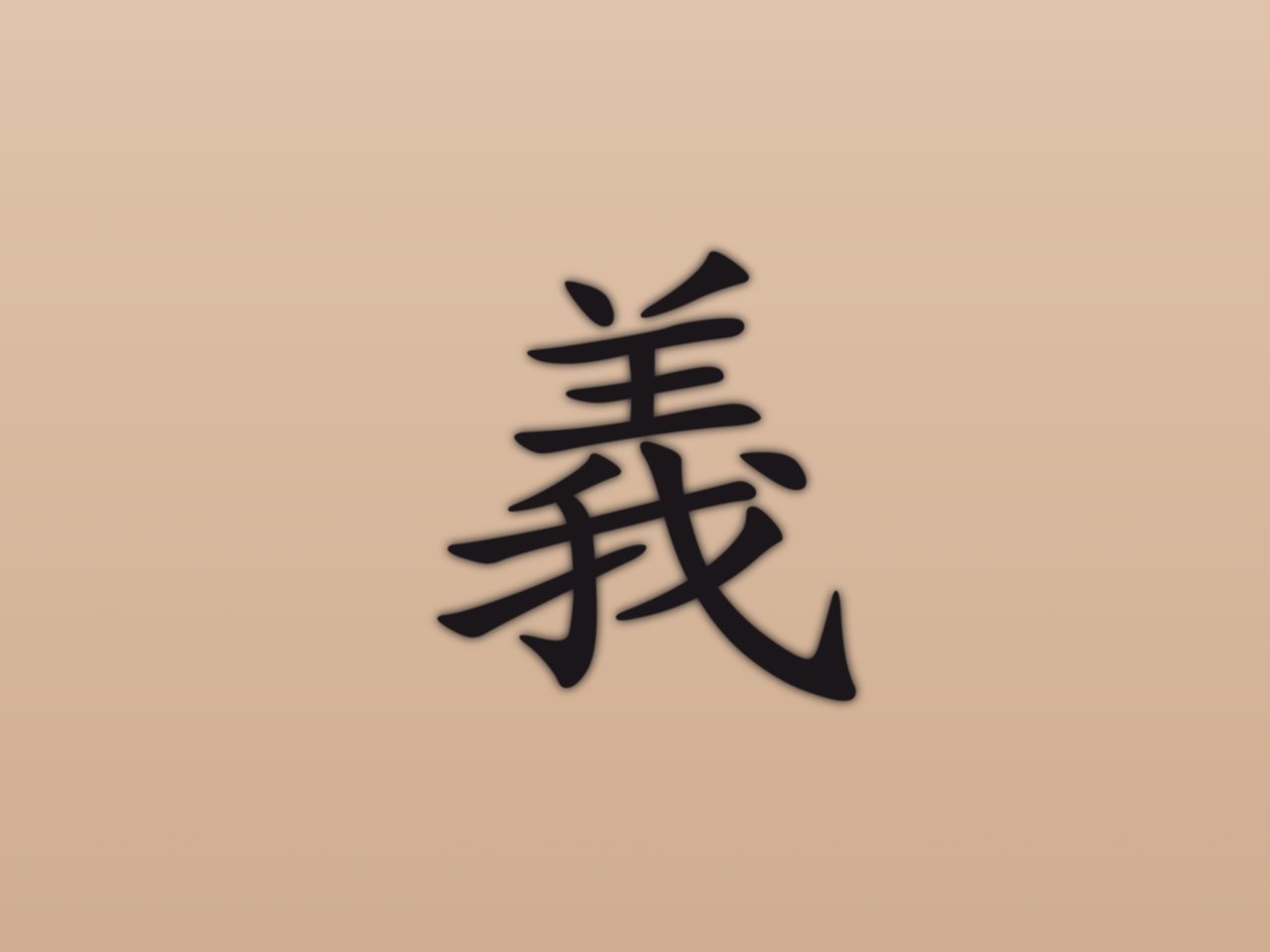
righteousness, traditional 13 5 2.0 4.0 8.0
simplified 3 1 10 20 40

Values at or below the 2mm working floor are marked. At 10mm, 6 of the 6 traditional forms are already at or under it, and not one of the simplified forms is.

Read the 10mm column and the 40mm column together, because that is the real finding. At 40mm, on a forearm or a shoulder blade, every form on the list has room and traditional is a free choice. At 10mm, behind an ear or on a wrist, the traditional forms are at or through the floor while the simplified ones still have two to four times the margin. The decision is not authenticity against modernity. It is how much skin you are giving the character.

The extreme case is on this list. , to listen, is twenty-two strokes, and it is a genuinely beautiful character built from an ear, a ruler, and a heart. At wrist size it is a smudge. Our entry on listening is the one place on this site where we recommend the traditional form outright, and the reason is that it needs to be big enough to read.

How little has to change

It is worth seeing, at size, how small the difference between a correct character and a wrong one can be.

One dot apart

good fortune, blessing

a rare, unrelated character

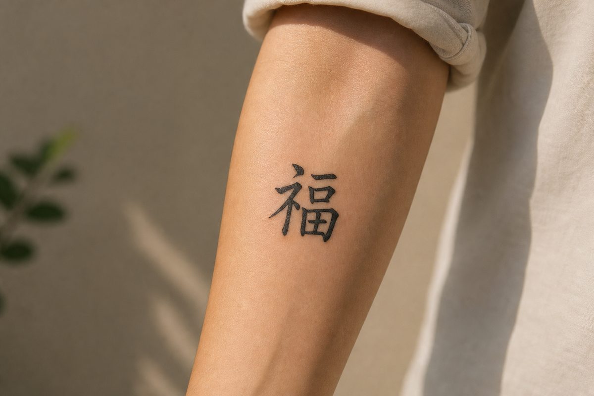
The left-hand component takes one dot in the first character and two in the second, which switches it from the altar radical to the clothing radical. Our entry on good fortune takes the pair apart properly. At the size a stencil is usually reviewed on a phone, the two are indistinguishable.

This is the argument for printing at final size rather than reviewing on a screen. A phone at arm's length flatters every design, and the errors that survive to the skin are almost always the ones that are invisible small and obvious large.

There are no men's characters and no women's characters

A large share of the search traffic on this subject asks for Chinese tattoos for guys or Chinese tattoos for women, so it is worth answering directly: Chinese characters carry no gender. There is no grammatical gender in the language and no tradition assigning characters to men or women. The division exists in Western tattoo marketing and nowhere else, and if you ask a Chinese person which characters are the masculine ones, you will get a puzzled look.

What is real, and is what those searches are actually reaching for, is a set of design questions with nothing to do with gender. How dense is the character at the size you want. Does it suit a linear placement along a forearm or a compact one on a shoulder. Do you want a form with visible internal structure or a minimal one that reads as a mark. Is the meaning something you want legible to strangers who read Chinese, or private. Those are worth thinking about carefully, and none of them sorts by who is wearing it.

The shortlist

Every character below has a full entry on this site: sourced etymology, what it does and does not mean, which forms are correct, and where the traps are. There are 28 of them rather than a hundred, because a hundred sourced entries is not a thing that exists, on this site or anywhere else, and a list longer than the research behind it is how this whole problem started.

Meaning Simplified Traditional Strokes
beautiful měi same 9
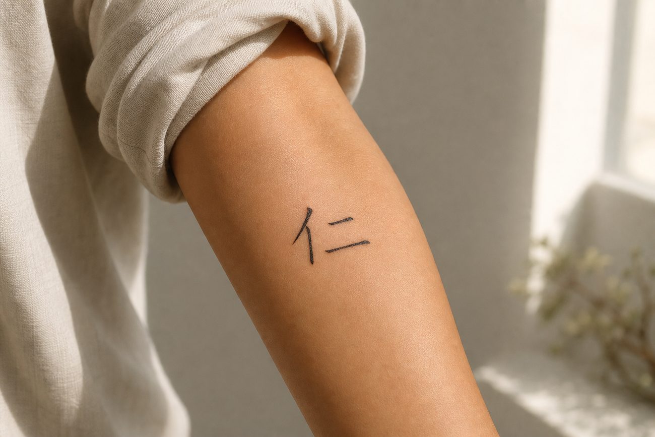
benevolence rén same 4
courage yǒng same 9
death same 6
double happiness same 24
dragon lóng 5
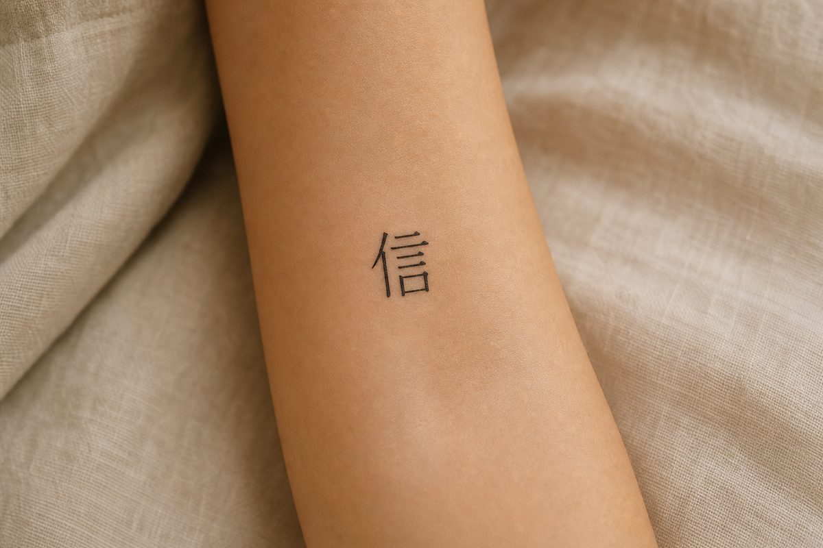
faith xìn same 9
family jiā same 10
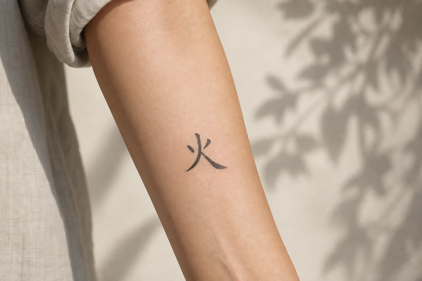
fire huǒ same 4
forever yǒng same 5
friendship yǒu same 4
good luck same 13
happiness 5
hope wàng same 11
joy same 12
life shēng same 5
longevity shòu 寿 7
love ài 10
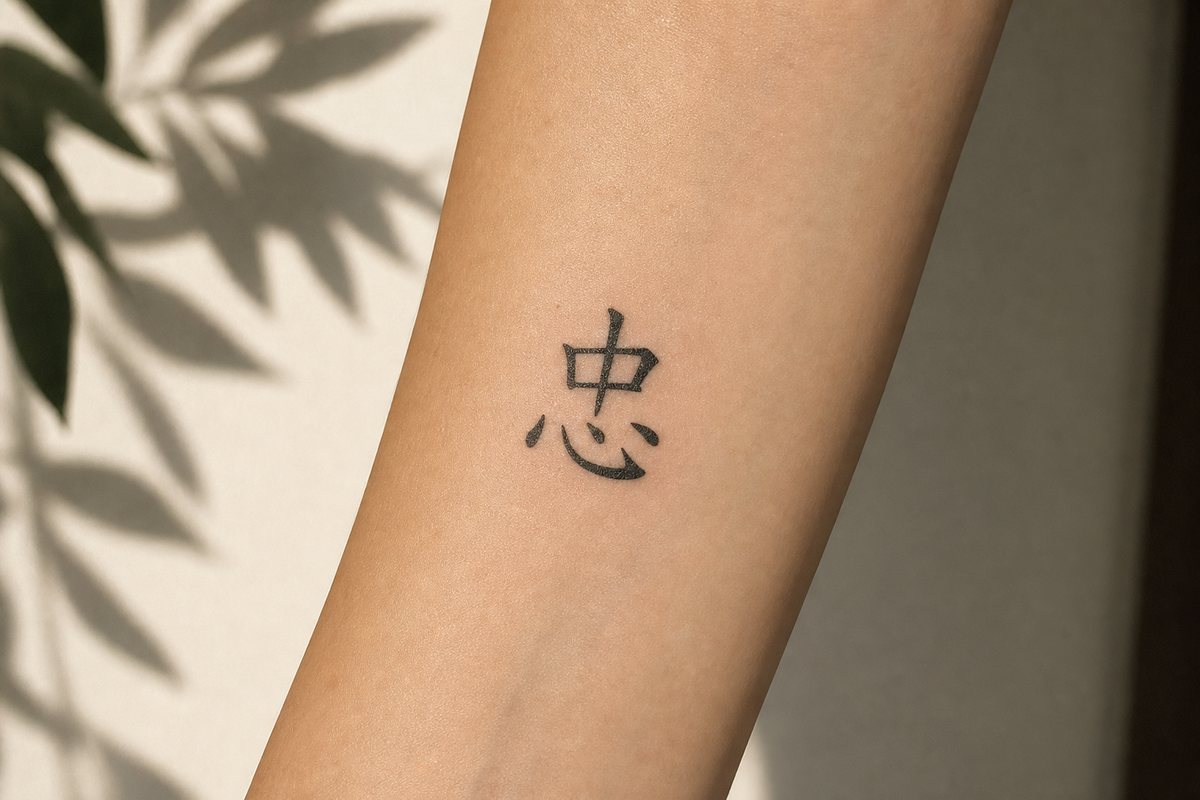
loyalty zhōng same 8
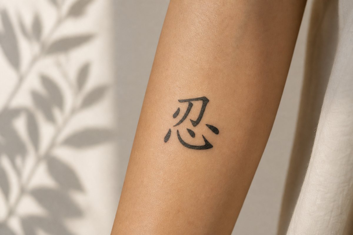
patience rěn same 7
peace same 8
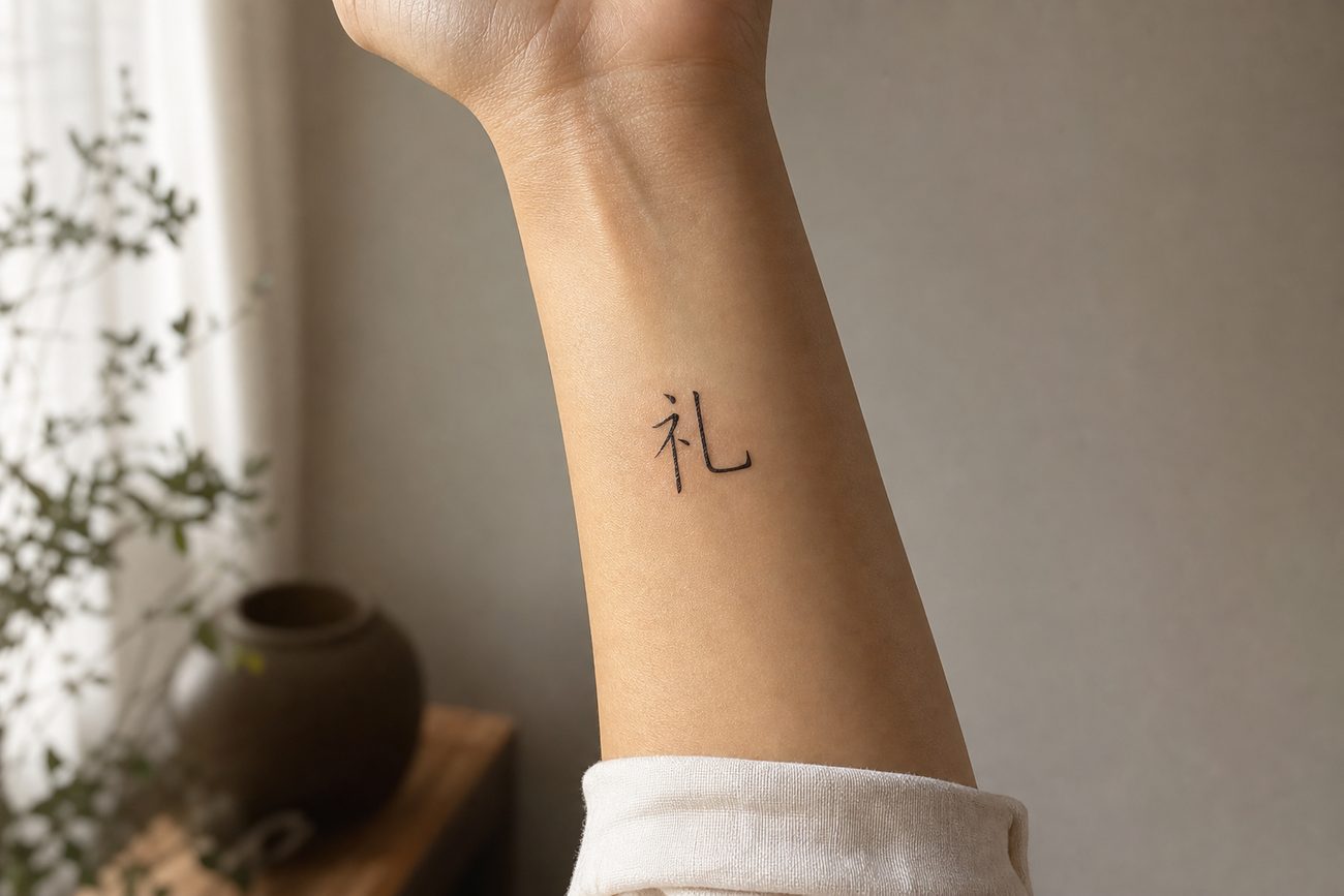
propriety 5
righteousness 3
strength same 2
war zhàn 9
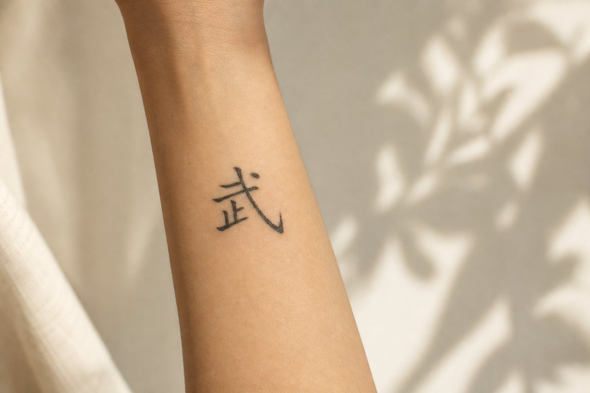
warrior same 8
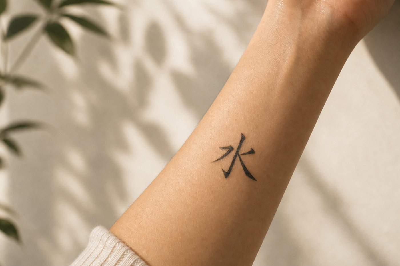
water shuǐ same 4
wisdom zhì same 12

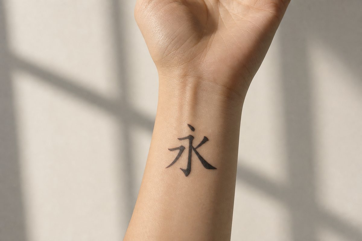
If you want one recommendation for a first small piece, take forever. Five strokes, identical in simplified and traditional, and it is the character Chinese calligraphy students are given first, because all eight of the basic strokes appear inside it. A character that teaches the writing system is a reasonable thing to wear.

The check, in order

  1. Confirm the character in a real reference. A dictionary entry or a sourced page, not an image search, not a translation app, never a letter chart.
  2. Read what it does not mean. If nobody can tell you which nearby characters it is not, nobody has told you what it is.
  3. Pick one system and hold it. Simplified or traditional, across every character in the piece.
  4. Print at final size. Not on a screen, not scaled. Then look at whether the internal strokes are still separate.
  5. Mirror-check the stencil. Thirty seconds, catches the flip.
  6. Ask a native reader two questions. What does it mean, and what does it make you feel. The second one catches everything the first one misses.

If you want the shape as a calligrapher would write it rather than as a system font renders it, our calligraphy generator will set any character in six classical scripts, and the running and cursive forms in particular give a tattoo artist something to work from that a stretched font does not.

Coming later

A second pair of eyes before it is permanent

We are building a check for exactly this: send the design, get back what the characters actually say, which system they are in, whether anything is flipped or mixed, and how a native reader hears it. It is not open yet. Leave an email and we will write once when it is.

What this page is not claiming

There are no photographs of other people's mistakes here, and there will not be. Every specimen on this page is text we set ourselves, in a real font, which you can select and check. A page arguing that people are careless with characters would be a poor place to start inventing evidence.

The stroke-clearance numbers are a model, not a measurement. The two-millimeter floor is a working rule from fine-line practice rather than a physical constant, skin and placement and needle and artist all move it, and the stacking counts are ours. Treat the table as a way of seeing the size of the gap between traditional and simplified forms, not as a specification.

And the eighth failure mode has no fix that this or any other page can give you, because it depends on a reaction rather than a fact. The only reliable instrument for it is a person who grew up reading the script. That remains true no matter how well sourced the page in front of you is, including this one.

Questions people ask

What is the most common mistake in Chinese tattoos?

Taking a character from a listicle that pairs it with a single English word. The character is usually genuine, so nothing looks obviously wrong, but Chinese frequently splits an English concept across several characters that a native reader distinguishes instantly. English "power" covers physical force, held authority, and situational momentum with three different characters. English "respect" splits between the inner attitude and its outward form. Outright gibberish, which comes from machine translation and from the letter-to-character charts kept in some studios, is more famous but less frequent than this quieter mismatch.

Should I get a simplified or traditional Chinese tattoo?

Both are correct, and the real constraint is size rather than authenticity. Traditional forms carry more of the character's history in visible components and generally look richer at scale. They also pack more strokes into the same area: at 10mm tall, several common traditional characters put their horizontal strokes closer together than the roughly 2mm that fine-line artists treat as the floor for parallel lines, which is the gap that closes as ink spreads over a decade. Simplified forms have two to four times the margin at the same size. Whichever you choose, use it consistently across the whole piece.

Are there Chinese symbols for men and Chinese symbols for women?

No. Chinese characters carry no grammatical gender and no gendered convention about who may wear them, and the idea that some are masculine and some feminine is a Western invention that exists mainly in tattoo marketing. The character for strength is not a men's character and the character for beauty is not a women's character. What does vary, and is worth thinking about, is stroke density, placement, and how a given character sits against the shape of the body part, which are design questions rather than gender ones.

How do I check a Chinese tattoo before getting it?

Five checks catch nearly everything. Print the design at the exact final size, not at screen size. Confirm the character in a dictionary or a sourced entry rather than an image search. Check that every character in the piece belongs to the same system, simplified or traditional. Hold the applied stencil against the reference in a mirror to rule out a flip. Then ask a native reader two separate questions: what does it mean, and what does it make you feel. The second question is the one that catches the correct-but-wrong cases.

What Chinese character is best for a first tattoo?

A low-stroke character whose meaning does not depend on a compound. Strength (2 strokes), righteousness in its simplified form (3), friendship (4), benevolence (4), and forever (5) all hold their shape at small sizes and mean on their own roughly what an English speaker expects. Forever has a particular claim: it is the character traditionally used to teach the eight basic strokes of Chinese writing, because all eight appear in it. Avoid dense traditional forms for a first small piece, and avoid single characters whose everyday sense lives inside two-character compounds.

Can a Chinese tattoo be offensive?

Rarely offensive, frequently unfortunate. The realistic risks are a character that reads as clinical or bureaucratic, a character with an underworld association that a reader will notice without commenting on, and a character so strongly tied to death or misfortune that nobody local would wear it. There is also the plain social cost of gibberish, which is not offense but a permanent, visible sign that you trusted a source that could not read. None of these is a reason to avoid the writing system. They are reasons to spend an hour on it.

Why do Chinese people react oddly to Western Chinese tattoos?

Usually because they are being polite about one of the failure modes on this page and do not want to spend the conversation explaining it to a stranger with a permanent mark. It is worth knowing that a correct, well-chosen character generally gets a genuinely warm response. The awkwardness is not about a foreigner wearing Chinese writing. It is about being asked to admire something that a reader can see went wrong and cannot be fixed.

Sources

  • • Hanzi Smatter, Tian Tang's archive of misused Chinese characters in Western tattoos and design, running since September 2004; origin of the "gibberish font" term for letter-to-character charts: source
  • • NPR, "Chinese Character Tattoos Lost in Translation" (2006), interview with Tian Tang on why alphabet-style charts cannot work: source
  • • Fine-line tattoo spacing guidance: negative space of at least 1.5x line width, and parallel lines in micro work kept at least 2mm apart: source
  • • Minimum font size and line weight for script tattoos, on legibility loss at small sizes: source
  • • Tattoo blowout and long-term ink migration: why lines set close together merge as a tattoo heals and ages: source
  • • Chinese Character Simplification Scheme (汉字简化方案), 1956, and the General List of Simplified Chinese Characters: source
  • • Stroke order (筆順): the standardized sequence for writing a character, and its effect on the shape of the finished glyph: source

Character by character

Chinese symbols and their meanings

Full sourced entries: what each character means, what it does not, and which forms are correct.

Failure mode five

Chinese characters vs. Japanese

Which characters have a distinctly Japanese shape, and the one-second test for telling the scripts apart.

See the shape

Calligraphy generator

Any character in six classical scripts, from print through running hand to full cursive.

Not a transcription

Chinese name generator

Names built to work as Chinese, rather than a sound-for-sound spelling of an English one.

Stay in the loop.

Chinese mythology, the zodiac, and the meaning behind names and symbols, rooted in the classics and read back to you. No spam. Unsubscribe anytime.